
Wall Art & Products
Gallery Wall Layout for Family Photos
Most gallery walls go wrong for one of two reasons, and neither of them is taste. Either the pieces were ordered before anybody measured the wall, or they were hung at whatever height the previous nail happened to be. Get the rectangle and the hanging measurements right and almost any set of good photographs will look designed. What follows is the order I work in with clients when we plan artwork for their home.
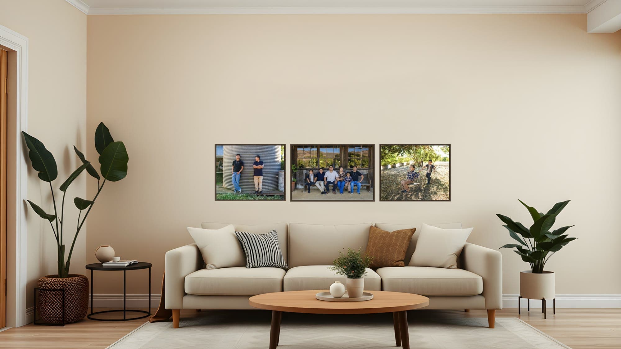
Measure the Wall Before You Choose Anything
A gallery wall is one shape made of several objects. Before you think about which photographs go in it, find the rectangle that shape is allowed to occupy: the usable width between the trim, the window casing, the light switch and the edge of the bookcase, and the usable height between the top of the furniture and the ceiling line. Write both numbers down. Everything after this is working inside them.
If the wall sits above a sofa, a bed or a console, the grouping wants to be about two-thirds the width of that piece of furniture. Frameology puts a 90-inch sofa with an arrangement around 60 inches wide, and that ratio holds up in real rooms: narrower and the artwork looks stranded, wider and it stops belonging to the furniture underneath it.
Only now does the question “how many pictures?” have an answer, because it is the rectangle that decides. Three large images almost always beat nine small ones on the same wall. A frame much under 11x14 inches stops reading as artwork from across a room and starts reading as a detail you have to walk up to. If you want help sizing an individual piece, my guide to canvas prints vs. framed photos covers surface, glazing and how big a single piece should be above furniture.
Five Layouts That Actually Work
There are only a handful of arrangements that hold up over years of looking at them, and family photographs suit some of them far better than others.
- 1
The grid
Identical frames, identical gaps, equal rows and columns. This is the layout for a set that is genuinely a set — one portrait of each child, one image from each year, the four frames from a single studio session. It is the easiest arrangement to hang because every measurement repeats, and the least forgiving if one gap is off by half an inch.
- 2
The row
One horizontal line of pieces, all sharing a center line. Three is the classic number and the reason triptychs sell: a row reads as calm and deliberate, and it suits a long sofa, a console table, or a hallway better than any clustered arrangement does. If the images are different heights, align the centers rather than the tops.
- 3
Anchor and flankers
One large image in the middle with smaller pieces either side, usually a horizontal anchor between two verticals. This is the arrangement I design most often for families, because it matches how a session actually shoots: one wide frame with everybody in it, and the quieter individual portraits standing beside it.
- 4
The off-center anchor
Place the largest frame slightly off-center and build the rest of the group outward from it. Done well it looks collected over time rather than installed in an afternoon. Done carelessly it just looks crooked, so this is the one layout worth templating on the floor before anything touches the wall.
- 5
The stair run
Frames climbing a staircase, each one stepped up by the same rise and across by the same run so the bottom edges follow the line of the stringer. Center height does not apply here — the repeating increment is what your eye is actually checking, and getting that constant is the whole job.
The Measurements That Do the Work
Whichever layout you pick, the same handful of measurements decide whether it looks considered or improvised.
| Measurement | What to use | Why |
|---|---|---|
| Center height | 57 to 60 inches from the floor | Measured to the center of the whole grouping, not of any one frame |
| Gap between frames | 2 to 3 inches (2.5 inches is a good default) | Same gap everywhere; consistency matters more than the number |
| Clearance above furniture | 4 to 10 inches above the sofa back | Tighter reads as intentional; much more and the group looks like it is floating |
| Width of the grouping | About two-thirds the width of the furniture below | A 90-inch sofa wants roughly 60 inches of arrangement, frames and gaps included |
The 57-inch figure is worth being honest about: it is a decorating convention, not a conservation standard, and the sources that quote it give a range rather than a rule. It is also a little below true adult eye level. The CDC puts average measured height for American adults at 68.9 inches for men and 63.5 inches for women, which puts most adults' eyes somewhere in the low sixties. Fifty-seven inches is the compromise — low enough to work for people sitting on the sofa underneath, high enough to work for people standing back across the room.
The rule that matters more than any single number: treat the whole arrangement as one visual block, and align at least one shared edge or center line across every piece in it. Center the block, not the frames.
Choose the Images Before the Frames
Every wall needs one image that leads. Usually it is the widest frame with everybody in it, and everything else on the wall is there to support it — the quiet portrait of one child, the hands, the two of you laughing at something off-camera. If three images on a wall are all competing to be the main one, the eye never settles, and no amount of correct spacing will fix that.
Mix scale and orientation, but not endlessly. A wide anchor with two verticals beside it gives you rhythm; six different sizes in six different orientations gives you noise. And be ruthless about the edit. The same discipline that makes a good album spread makes a good wall: fewer images, chosen for what each one adds rather than for who would be upset to be left out. I write about that trade in more detail in photo album vs. photo book.
Images from a single session hang together automatically, because the light, the color palette and the clothing already match. Images pulled from eight different years do not, which is exactly what the next rule is for.
Keep One Thing Constant
A gallery wall reads as designed when something repeats across every piece. It does not matter much which thing, but there has to be one:
- The frame — the same molding and finish on every piece. The simplest fix, and the one I recommend when the photographs come from different years.
- The mat — varied frames are fine if the mat color and width are identical throughout.
- The treatment — make every image black and white and a mismatched set becomes a collection.
- The source — everything from one session, where the light and the clothing already do the unifying for you.
One constant is enough. Zero constants is what makes a wall look like a pile of pictures that arrived separately, which is usually exactly what happened.
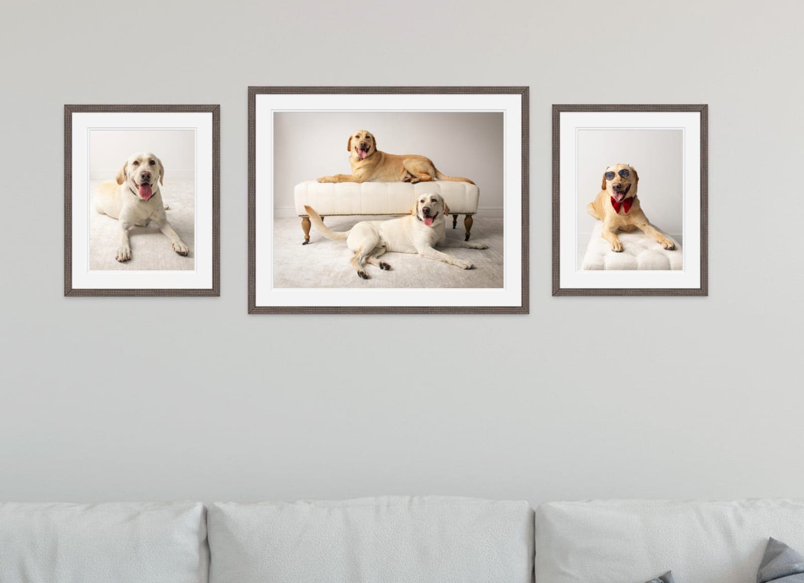
Template It Before You Drill
Nobody gets a multi-piece arrangement right by eye, and every correction is a hole. Cut a paper rectangle the exact outer size of each frame, write the frame name on it, and tape the set to the wall with painter's tape. Stand across the room. Live with it for a day, because the arrangement that looks right at arm's length often does not from the doorway.
When the paper looks right, do the hardware math on the paper rather than on the wall: measure from the top edge of the frame down to the taut hanging wire or the hook, mark that point on the paper template, and drive the nail straight through the mark. Then tear the paper off. Every nail lands where you decided it should, and the only holes in your wall are the ones holding something up.
If the layout is a complicated one — an off-center anchor, or anything over about five pieces — lay the frames out on the floor first in the same rectangle as the wall, and only then cut the paper.
Which Wall, and Why It Matters
The best-arranged gallery wall in the house is still the wrong one if it is the wall that takes full afternoon sun. Light damage to photographs is cumulative and it does not reverse. The American Institute for Conservation's Photographic Materials Group is blunt that “there is no agreed upon standard for illumination type, illumination level, or duration of exhibition,” and its practical guidance is to keep light exposure “to the minimum level that will both safely illuminate the photograph” and reduce ultraviolet radiation “as much as possible.” In a house, that translates simply: not the wall opposite a west-facing window, and conservation glazing on anything you care about, which my wall art guide covers in detail.
Humidity is the other one, and it rules out more walls than people expect. The Library of Congress calls relative humidity “the single most important factor in preserving most photographic prints,” recommends “a relatively dry (30-50% relative humidity (RH)), cool (70°F or below), and stable environment,” and advises that “RH fluctuations should be less than 5% within a 24 hour period.” A living room or hallway wall is fine. A bathroom, a laundry room, an unconditioned garage, or the wall directly above a working fireplace is not, however good the layout would have looked there.
How We Plan This Together
None of the above is work I expect you to do alone. Before your session I ask which wall the artwork is for and what is underneath it, and at your reveal and design appointment we choose the images and the arrangement together, at the sizes they will actually be printed. Seeing a 30-inch piece represented at 30 inches is the whole point — almost everybody underestimates size on a screen, and the most common regret I hear is that someone wishes they had gone bigger.
That planning is built into the experience for every family session, and the finished pieces — framed prints, canvases, multi-piece wall groupings and designer albums — are all on the wall art and products page.
Sources
- Frameology — 7 Gallery Wall Rules for a Polished, Cohesive Look (“Keep 2-3 inches between every frame, and use 2.5 inches as your default for most clusters”; “Center the entire arrangement 57-60 inches from the floor”; “Hang the bottom frame 4-8 inches above furniture”; “keep the gallery width at roughly two-thirds of the furniture below it” with a 90-inch sofa example at about 60 inches; “Align at least one shared edge or centerline across the entire grouping”; “Treat the entire grouping as one visual block”; “Place the largest frame slightly off-center, then build outward”; “Map every nail position with a gallery wall template before you pick up a hammer”)
- Chairish — How High to Hang Artwork: A Designer's Guide With Measurements (“the center of the artwork should be around 57 to 60 inches from the floor”; “This measurement is based on the average human eye level”; for a grouping, “treat the entire collection as a single piece. Find the center point of the arrangement”; “leave about 6 to 12 inches of space between the top of the furniture and the bottom of the artwork”; “In a living room where people are often seated, you might want to hang art slightly lower”)
- CDC, National Center for Health Statistics — Body Measurements (mean measured height for adults aged 20 and over: 68.9 inches for men and 63.5 inches for women, from Anthropometric Reference Data for Children and Adults: United States, August 2021–August 2023)
- American Institute for Conservation, Photographic Materials Group — Standards, Guidelines, and Recommendations for Light Levels During Exhibition (“Currently, there is no agreed upon standard for illumination type, illumination level, or duration of exhibition”; “Light exposure should be kept to the minimum level that will both safely illuminate the photograph”; “Ultraviolet radiation should be reduced as much as possible”; “damage from exposure is cumulative”)
- Library of Congress — Care, Handling and Storage of Photographs (“Relative humidity is the single most important factor in preserving most photographic prints”; “A relatively dry (30-50% relative humidity (RH)), cool (70°F or below), and stable environment is best”; “Ideally, RH fluctuations should be less than 5% within a 24 hour period”; “Limit light exposure”)